|
|
SUBSIM: The Web's #1 resource for all submarine & naval simulations since 1997
 |
SUBSIM: The Web's #1 resource for all submarine & naval simulations since 1997 |
 06-03-22, 01:02 PM
|
#1 |
|
The Analyst
|
Hi,
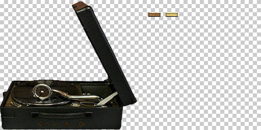
I am currently working on a new gramophone and I will replace the existing one with an Electrola Modell C106UP.  However, I'm not sure if I'm going to leave the Electrola static with just the control buttons like the original have, or if I'm add an animation for opening and closing when clicking play and stop. 
__________________
Best regards, GrenSo Mankind must put an end to war, or war will put an end to mankind. - J.F.K. |

|

|
 06-03-22, 08:17 PM
|
#2 |
|
Canadian Wolf
|
Nice, look forward to the finished product

|

|

|
 06-04-22, 07:52 AM
|
#3 |
|
The Analyst
|
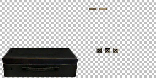
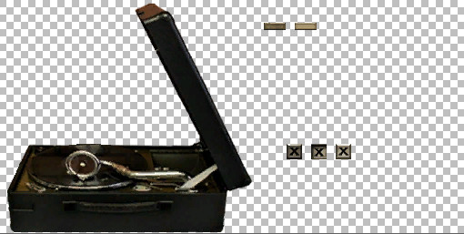
Small update to the previous graphics in the open and closed state.
  My thinking is that the closed version will have 2 buttons. A button to close the gramophone (X button) and a play button to open the gramophone and play the music. The open version should have 4 buttons. The X button like the closed version have, a next and previous button and a stop button to close the gramophone and stop the music.
__________________
Best regards, GrenSo Mankind must put an end to war, or war will put an end to mankind. - J.F.K. |

|

|
 06-04-22, 09:47 AM
|
#4 |
|
Argentinian Skipper
|
Looking forward to this...Many thanks!
 Fitzcarraldo 
__________________
 My subject is War, and the pity of War. The Poetry is in the pity - Wilfred Owen. |

|

|
 06-04-22, 04:27 PM
|
#5 |
|
Kapitain Leutnant
Join Date: May 2010
Location: GlanerBrucke
Posts: 419
Downloads: 249
Uploads: 0
|
Keep up the good work grenso

|

|

|
 06-04-22, 05:01 PM
|
#6 | |||
|
Navy Seal
 Join Date: Jan 2011
Location: CJ8937
Posts: 8,215
Downloads: 793
Uploads: 10
|
Quote:
 Quote:
I am also wondering on the feasibility on a spinning vynil, though animating it might be more work than it is worth. Last, before you start messing with UI settings, I really think that you should correct the perspective distortion in your texture. In my opinion the gramophone would look much better if its frontal part looked more or less straight 
|
|||

|

|
 06-04-22, 05:08 PM
|
#7 |
|
Village Idiot
|
Could use a spin like aircraft props for the record.
Then again?  You Guys have no CLUE what I'm working on with animations!  Part of the work is hacking the hell out of TDW's program. |

|

|
 06-04-22, 05:35 PM
|
#8 | |
|
Navy Seal
 Join Date: Jan 2011
Location: CJ8937
Posts: 8,215
Downloads: 793
Uploads: 10
|
Quote:
 Though flat, aircraft props are 3D objects. Here we are discussing about 2D interface lemensts, even though making a wise use of perspective we might make it to look more or less 3D... |
|

|

|
 06-07-22, 05:11 AM
|
#9 | |
|
The Analyst
|
Quote:
What exactly do you mean? I took extra pictures as templates that don't show the gramophone in almost 2D, but rather in 3D perspective. This way you look slightly at the gramophone from above, and I like it better that way than directly from the side or just directly from above.
__________________
Best regards, GrenSo Mankind must put an end to war, or war will put an end to mankind. - J.F.K. |
|

|

|
 06-07-22, 06:43 PM
|
#10 | |
|
Navy Seal
 Join Date: Jan 2011
Location: CJ8937
Posts: 8,215
Downloads: 793
Uploads: 10
|
Quote:
A picture will probably say more than many words:  Blame my preference to me being a photographer. In photography converging/diverging horizontal lines are generally accepted for denoting a strong perspective, but non-parallel vertical lines (like when we take a picture of a tall building with a wide angle lens, and we tilt up the camera so to frame most of it) are mostly considered a distortion. Also note that for a portable record player a top view would be appropriate too since, once open, most of its "interface" is likely to be placed on its top and you would get plenty of space for setting up some interactive buttons there. |
|

|

|
 06-08-22, 12:28 AM
|
#11 |
|
The Analyst
|
Ah okay, now I know what you mean. In my defence, however, I have to say that I created the cover of the suitcase by hand and without a template because I couldn't find a suitable picture.
__________________
Best regards, GrenSo Mankind must put an end to war, or war will put an end to mankind. - J.F.K. |

|

|
 06-08-22, 05:56 AM
|
#12 |
|
Navy Seal
 Join Date: Jan 2011
Location: CJ8937
Posts: 8,215
Downloads: 793
Uploads: 10
|
 You don't need any defence, you have done an excellent job! |

|

|
 06-12-22, 08:22 AM
|
#13 |
|
The Analyst
|
__________________
Best regards, GrenSo Mankind must put an end to war, or war will put an end to mankind. - J.F.K. |

|

|
 06-12-22, 02:55 PM
|
#14 |
|
Navy Seal
 Join Date: Jan 2011
Location: CJ8937
Posts: 8,215
Downloads: 793
Uploads: 10
|
|

|

|
 06-12-22, 03:01 PM
|
#15 |
|
The Analyst
|
Yes, you are right. It looks better now.
 But I think I will first finish my version of silentmichal's interior before I finish the gramophone.
__________________
Best regards, GrenSo Mankind must put an end to war, or war will put an end to mankind. - J.F.K. |

|

|
 |
|
|
